Grid
The grid control is a table with columns and rows (often referred to as lines). Grid functionality is similar to how you would use a spreadsheet, like in Excel for example. In this section we will first explain the grid functionality from a user perspective. After that we will explain how administrators can configure a grid control and use it in a layout.
Using the grid control
As a user you will probably interact with a grid control quite a lot. The grid control is often used to present a list of documents to choose from, and in a lot of processes these documents will contain document lines. These lines can contain information about worked hours on a project in a timesheet for instance.
A list of documents
Whenever the grid control displays a list of documents, you can either:
- Open a document by selecting a line in the grid. You can do this by single-clicking a line.
- Run a bulk action (if configured) by checking the checkbox on one or more lines and clicking (or tapping on mobile) the action button. Alternatively, if you want to run all actions on all documents, you can click/tap the checkbox located in the table header at the top to select all documents. This checkbox can also be used to to deselect all items when all items have been selected.
Document lines
When the grid is used within a document it will contain so-called document lines. Depending on your permissions you can create, edit, delete, or duplicate lines. The grid control has a range of options to facilitate easy modification of the information.
Grid navigation
As mentioned before, navigating the BizzStream Aero grid control is similar to navigating a spreadsheet. You have the following options to move through the lines and cells of the grid control:
Using your mouse
- With a single click you can set focus on a cell.
- With a double click the cell is set to edit mode.
- By holding the
Shiftkey you can check a range of lines at once. E.g. If you check the checkbox on the first line, hold theShiftkey and click the 10th line, all lines in between will also be checked. - The column width can be set by dragging the border of a column to the desired width. Once changed, the settings will be stored in your user preferences.
The next time you will open the layout the column widths will be the same as you configured them.
Using your keyboard
- Anywhere in the grid you can start typing to set the field you're currently on into edit mode, and the data you type will be entered into the field.
- Note that the type of the field determines whether your data input is allowed. E.g. you cannot enter text into a number field.
- By pressing the
Tabkey you will move to the next field (i.e. cell)- The data you entered will be stored as the field value. Note: only on the client, so not in the database.
- The next field will automatically open in edit mode.
- If you press
Tabon the last field in the line, you will move to the first field in the next line. If there is no next line, a new line will be created.
Keep in mind that this is only allowed when the user has permissions to create new lines.
- By pressing the
Shift + Tabkey you will move to the previous field (i.e cell).- Just like with only pressing the
Tabkey, the data you entered will be stored as the field value. Note: only on the client, so not in the database. - The previous field will automatically open in edit mode.
- If you press
Tabon the first field in the line, you will move to the first field in the previous line. If there is no previous line, a new line will be created.
- Just like with only pressing the
- By pressing the
Enterkey you will leave edit mode and the value will be stored in the field. - By pressing the
Esckey you will leave edit mode and the field will be restored to its previous value, if available.
This means you basically discard any changes you made to the field. - As long as there is no field in edit mode, you can navigate the grid using the arrow keys.
Some field types support additional functionality:
- In a reference field you can open and close the dropdown list by pressing
ALT + Arrowon Windows andOption + Arrowon MacOS.
It also works by pressingALT + Arrow upon Windows andOption + Arrow upon MacOS. - For fields with popups pressing
any keywill open the popup and set the first field in the popup (if applicable) in edit mode.- By pressing
CTRL + Enteron Windows andCMD + Enteron MacOS the popup will close, storing all changes you made. - By pressing the
Esckey the popup will close, discarding any changes you made. Taballows you to move focus/edit mode between controls within the popup.
- By pressing
- To change the value of a checkbox, you can press the
space bar.
Copy data in a grid
The grid control has a range of options for easily reusing information from existing lines:
- By pressing
CTRL + Don Windows andCMD + Don MacOS you can duplicate the lines for which you checked the checkbox.
The copied lines will be added to the bottom of the grid. - By pressing
CTRL + SHIFT + Don Windows andCMD + SHIFT + Don MacOS duplicated lines will be added directly below the checked lines. - You can copy data into a line field from the field directly above by pressing
CTRL + 'on Windows andCMD + 'on MacOS or by using the Insert key.- Note that dynamic values or filters (in case of a reference field) may affect the result of this copy action.
- It is also possible to copy to, and paste from, clipboard.
- To select a range of cells, click and drag on the grid, you can also select a grid cell and whilst holding
Shiftkey use theArrow keysto select more cells. - If you then press
CTRL + Con Windows andCMD + Con MacOS, the selected cells will be copied to the clipboard. This is done in CSV format, so it can be copied over into Excel, Numbers, Google Spreadsheet and also into the BizzStream grids. - To paste the data from clipboard, select a cell and press
CTRL + Von Windows andCMD + Von MacOS. The data will be pasted starting with the selected cell. When the paste in data contains more rows and/or columns than there are available, we only paste in data that fits into the available space. - Note that dynamic values, filters, or other validations may affect the result of your paste action.
- To select a range of cells, click and drag on the grid, you can also select a grid cell and whilst holding
- It is possible to create a number of lines at once by using the overlay layout (if modeled):
- Open the overlay layout from a 1-1 reference field.
- Check the checkboxes for items for which you want to create a line.
- Click OK.
- The first value you checked in the overlay layout will be placed in the reference field from which you opened the overlay layout.
- For the remaining checked items a new line per item will be created and the values will be placed in the reference field in the respective lines.
- The remaining line field values will be copied into the newly created lines.
- Note that dynamic values or filters (in case of a reference field) may affect the result of this copy action.
Grid configuration in the layout
An administrator will define what the grid control will look like in the layout:
- Ordering of the fields (i.e. columns)
- Sorting of the data
- Column widths
- Highlight conditions
- Field specific configurations
Adding a grid to the layout
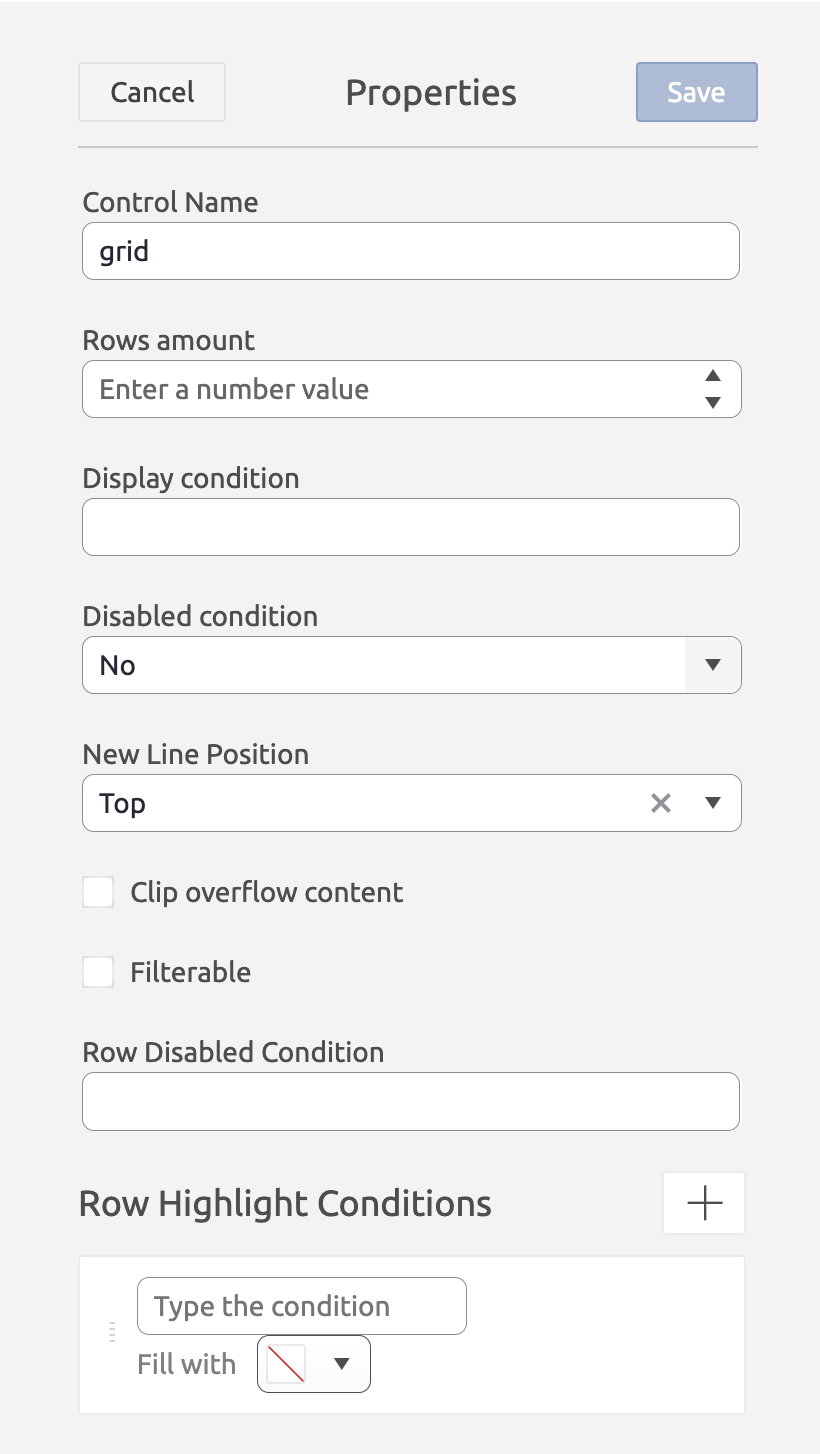
To add a grid control to the layout, simply drag a grid control from the Generic Controls bar on the left-hand side. After adding the grid, it will have a blue overlay. This is an indication that it does not yet have a dataset assigned to it. 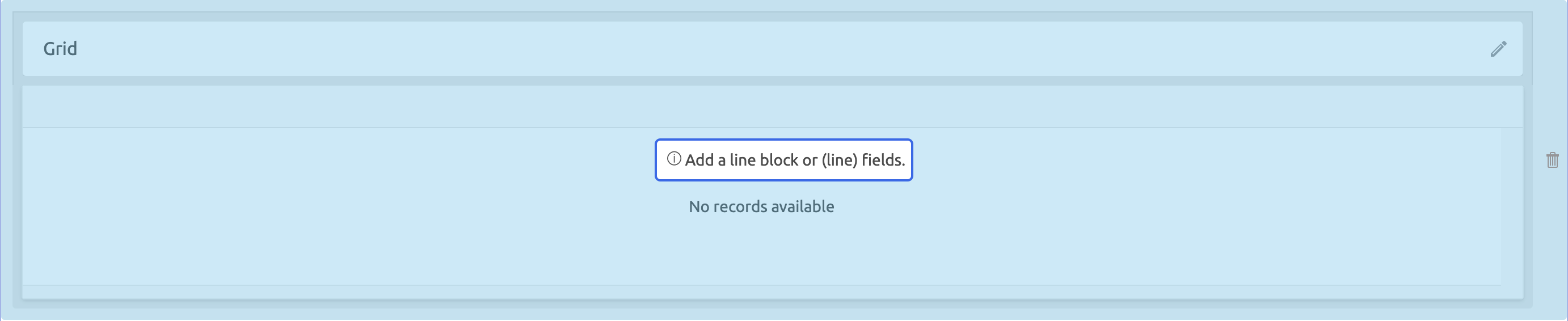 Upon dropping the grid, the properties pane will open on the right. Here, you can configure a range of properties that apply to the control as a whole. The grid control has the following properties:
Control Name (Required) This is used to reference the grid in (for instance) a menu path or a filter. The control name should be unique within a layout Rows Amount (Optional) The size of the grid in terms of rows. This includes the header row. If left empty, the grid will be as high as its contents. On mobile the height of the grid is automatically capped to improve navigation. Display condition (Optional) A BizzStream expression that determines under what circumstances the grid control should be displayed. Disabled Condition (Optional) If "Yes", users are able to make changes to the data in the grid. If "No", users are unable to make changes to the data in the grid. If "Conditional", a BizzStream expression will determine whether or not users can make changes to the data in the grid. New Line Position (Optional) Determines the position a new line will be created. New lines can either be created on the top of the grid, the bottom of the grid, or below the currently selected line. By default new lines will be added to the bottom of the grid. Clip Overflowing Content (Optional) If checked, field values will be clipped with ellipsis. This ensures the height of a row will be set to a single line. Filterable (Optional) If checked, users will be able to filter columns by configuring it in the header cell. Row Disabled Condition (Optional) A BizzStream expression to determine whether or not users can make changes to the data in a particular row in the grid. For instance, if a line field has a particular value, the grid should become read-only. Row Highlight Conditions (Optional) Allows you to choose a color and configure a BizzStream expression. If the BizzStream expression resolves to true, the color will be applied to the grid row. Cell Action Display Mode (Optional) Allows you to choose a way to present the cell actions to the user. Always shows the actions always, also when the user can not use the buttons. Edit permissions only will only show the user has the correct permissions. Hover makes the action only visible when the user hovers the cell. |
  |
Configuring line fields and columns
After adding the grid control to the layout, and configuring the basics, you can start adding fields to the grid. Since the grid is essentially a table, fields will be rendered as columns. You can add fields to the grid by simply dragging them from the Dataset sidebar on the left-hand side onto the grid control.
- For document list datasets fields can be added one by one.
- A grid connected to a document list dataset will contain header fields.
- For document datasets, entire line blocks can be added at once.
- A grid connected to a document dataset will contain line fields.
Note that only a grid control can contain fields from only one dataset at a time. If you try to drop a field from a dataset different from the fields already in the grid, a red overlay will be displayed. In addition to adding fields, you can also add buttons or labels to the grid toolbar.
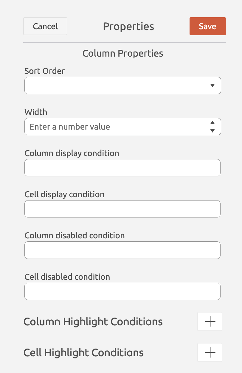
Column Properties
A range of properties can be set with respect to the grid column. These properties can be set on every column in the grid. Note that some properties, for instance sorting don't apply for certain field types (e.g. it does not make sense to sort on a signature field.). Moreover, these properties can be set on both overview grids as well as document line grids.
Sort Order Here you can set the sort order for the selected column to either Ascending or Descending. Width The width of the column as a percentage of the width of the entire grid. Column Display condition A BizzStream expression that determines under what circumstances the column should be displayed. Cell Display condition A BizzStream expression that determines under what circumstances the cell data should be displayed. Column Disabled Condition A BizzStream expression that determines under what circumstances the column should be editable by the user. For instance, if a (line) field has a particular value, the column should become read-only. Cell Disabled Condition A BizzStream expression that determines under what circumstances the cell should be editable by the user. For instance, if a line field has a particular value, the cell should become read-only. Column Highlight Condition llows you to choose a color and configure a BizzStream expression. If the BizzStream expression resolves to true, the color will be applied to the grid column. Cell Highlight Conditions (Optional) Allows you to choose a color and configure a BizzStream expression. If the BizzStream expression resolves to true, the color will be applied to the grid cell. |
 |
Line Field Properties
Properties specific for each line. When adding more lines you can edit them all in the Column/Line Field properties all in one place.
Cell Actions Defines actions that can be triggered directly from a cell within the line field, such as opening a dialog or executing a script. Display condition expression Allows you to set a condition for displaying cell actions. The data is taken relative to the row from which the buttons can be displayed independently of the grid and rows. If the field is empty, the display is always true. Execute condition Allows for dynamic configuration of cell actions, through a BizzStream Expression, enabling flexible behavior based on data. Custom Label When hovered over the action itself this label will be visible. |
 |